IDUNN

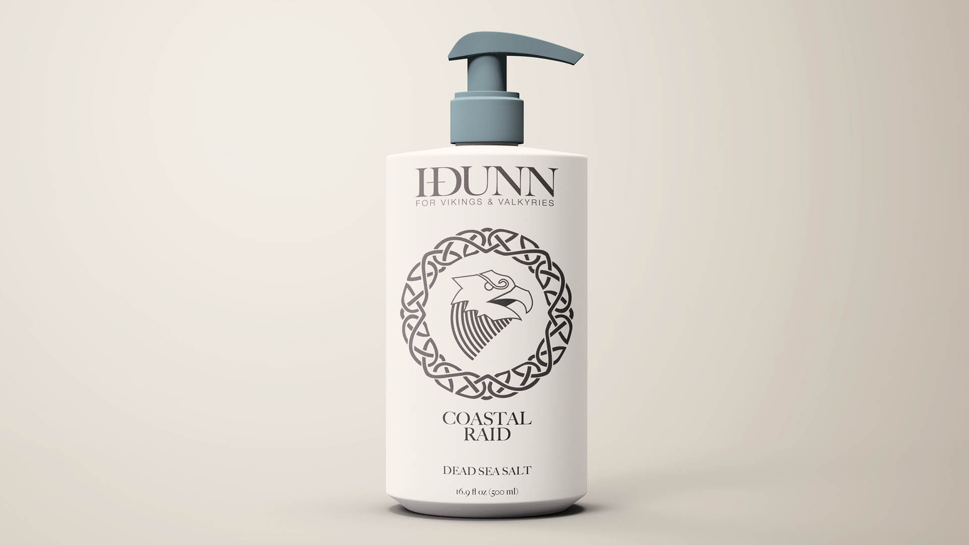
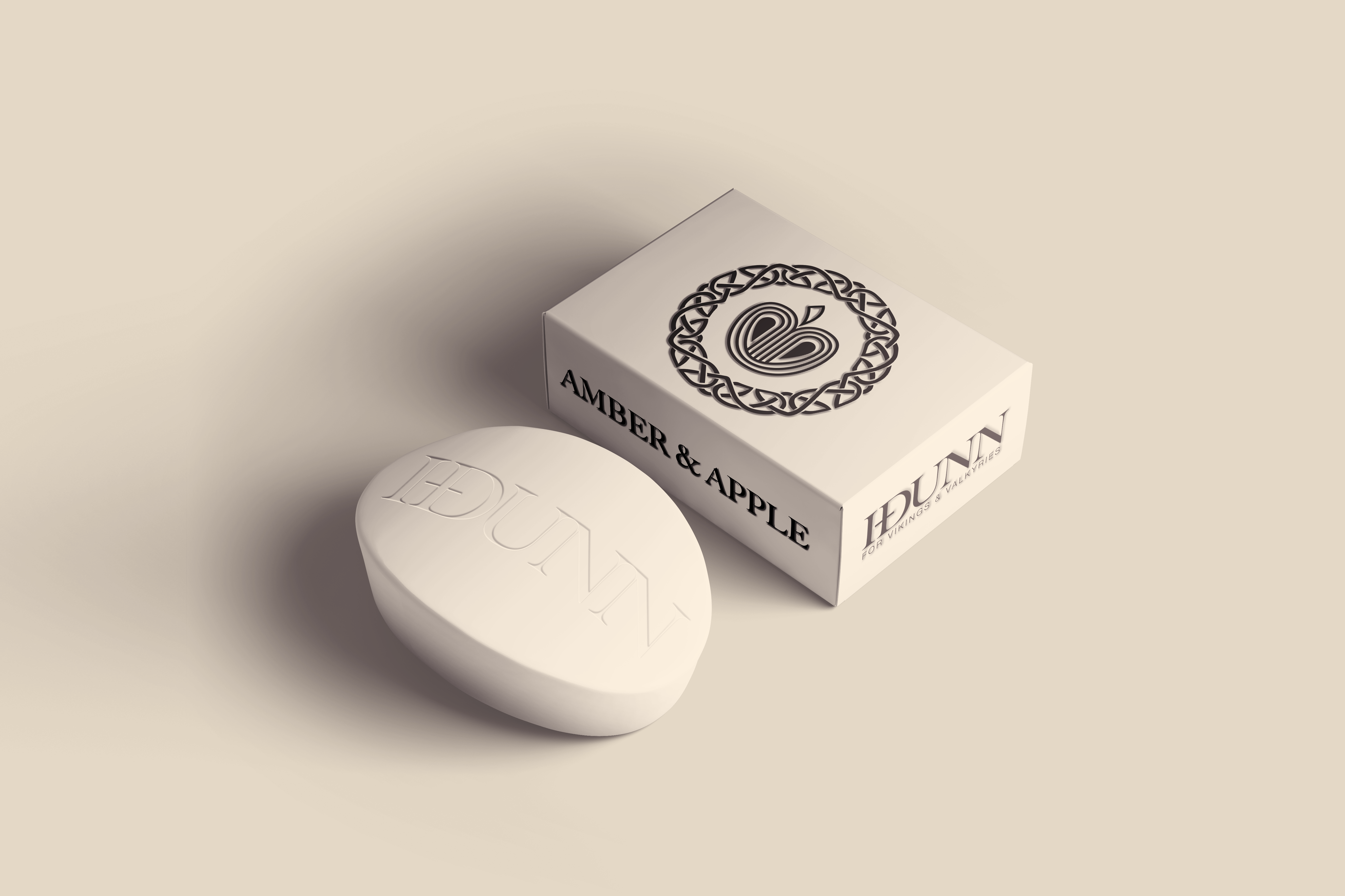
Idunn is a fictional Nordic start-up attempting to break into the boutique soap market by appealing to more rugged men and women who still appreciate some sophistication i.e the modern viking. They wanted a raw but refined design, engaging the user with a strong tone of voice whilst not patronising them.
In response to this I have drawn from traditional norse illustrative design to develop a slick but tough iconography. I named the fictional brand “Idunn” in lieu of the titular norse goddess, whose golden apples ensured the youthfullness of the gods.

Process

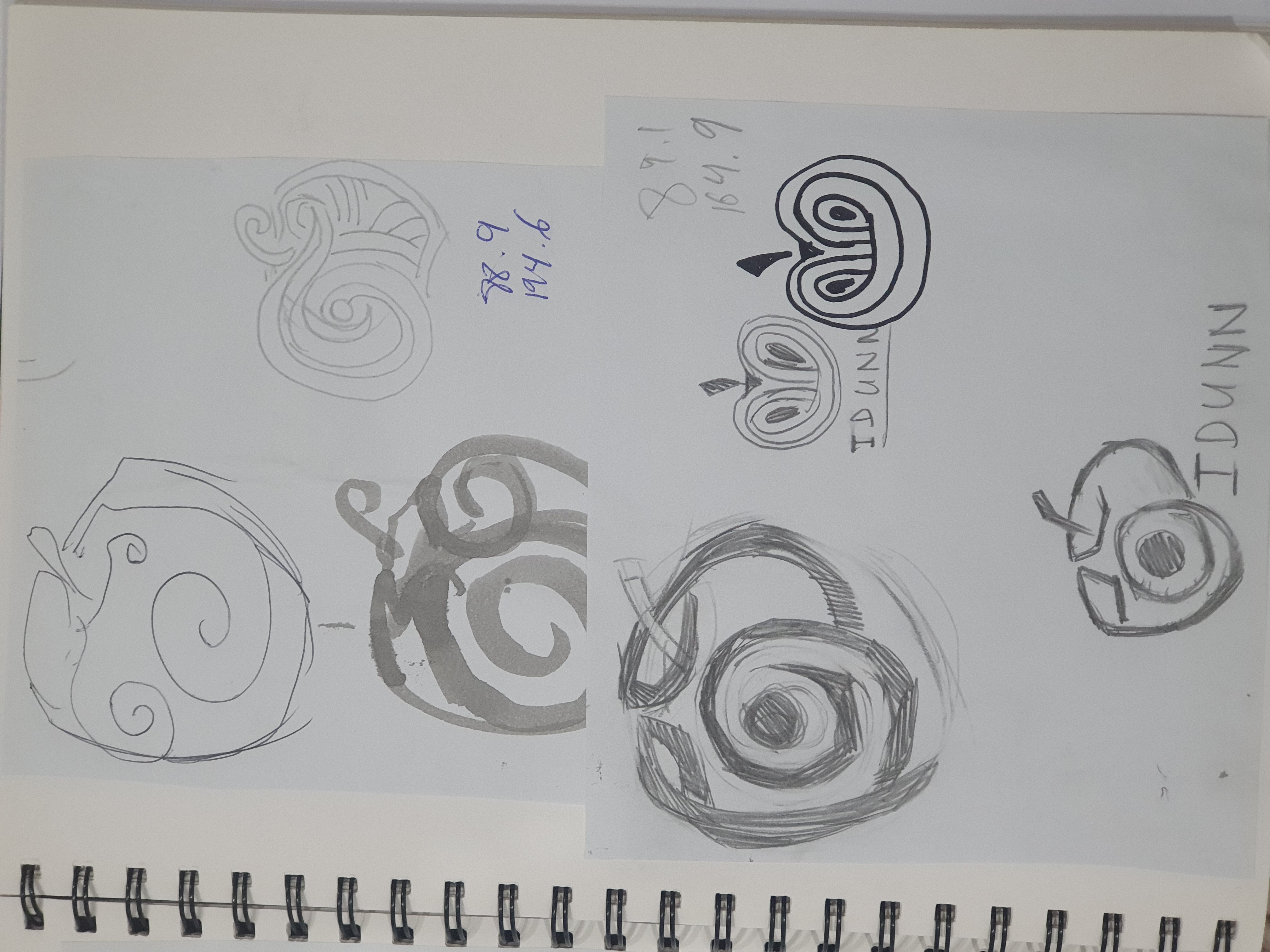
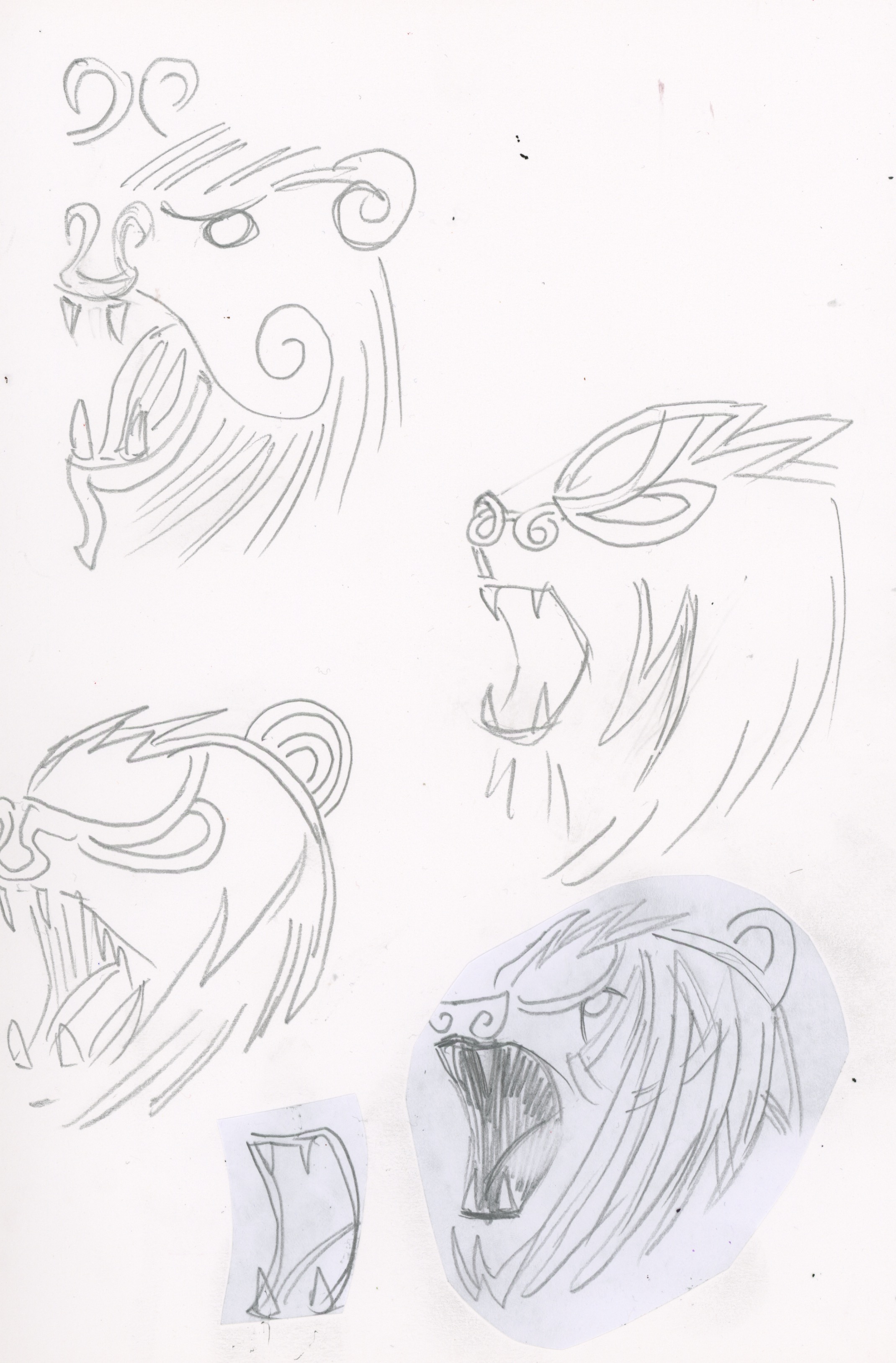

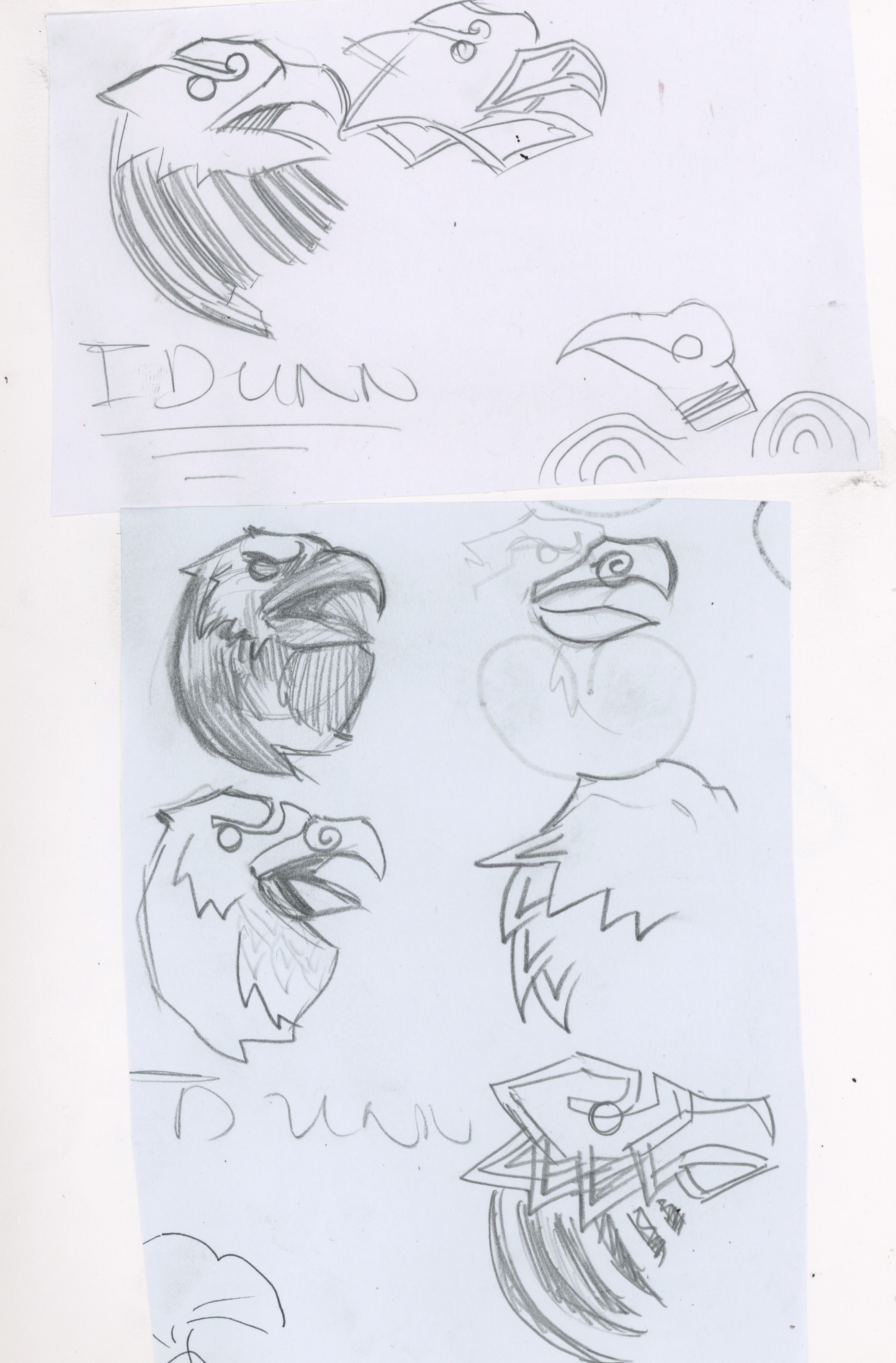


Once I decided Idunn’s tagline would be “For Vikings and Valkyries”, it was logical to take inspiration from traditional viking art- in particular the interwoven knots of the Jellinge style, and the representations of animals in the Borre style.After brainstorming the different scents and textures the brand would use, I identified different symbols to use as icons for them. For this I started with slightly stylistic but more realistic drawings of each symbol and then gradually simplifying their shapes and introducing the Jellinge/Borre styles into each piece.
Initially, I applied these designs in the following matter, however, I found these designs to lack the visual clarity or finesse that the brand needed.
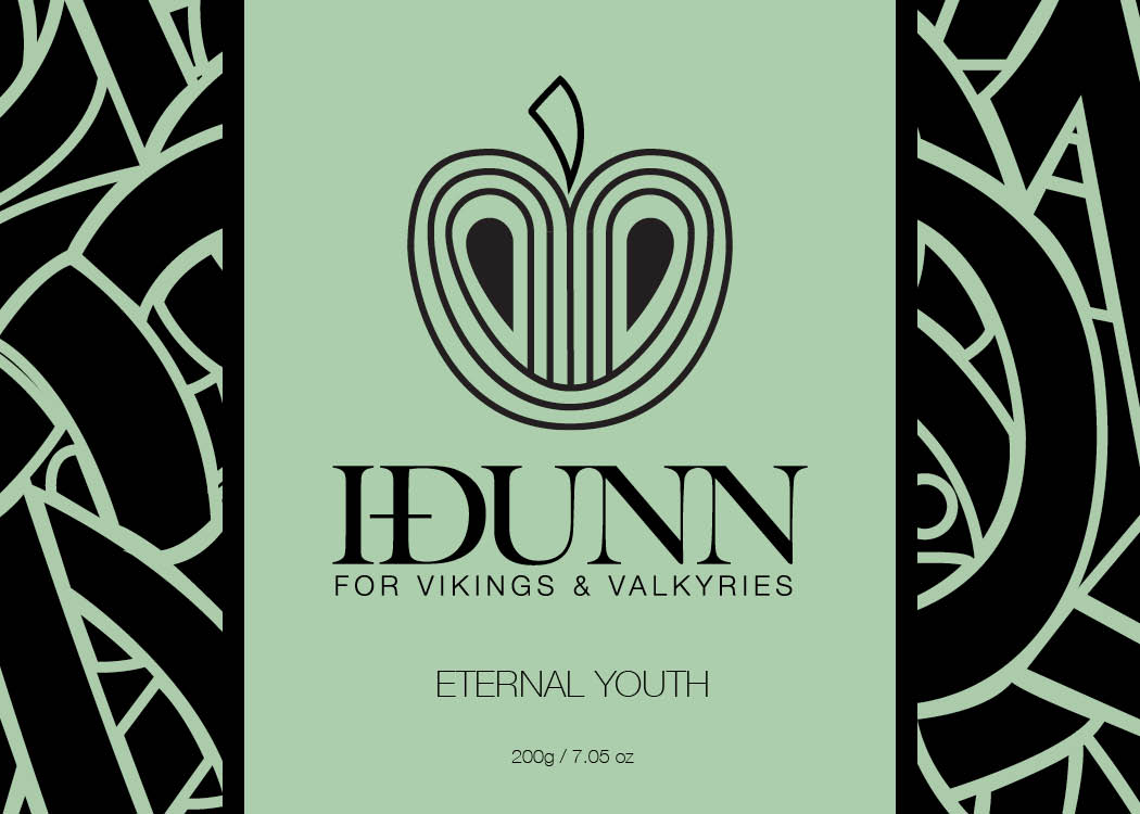

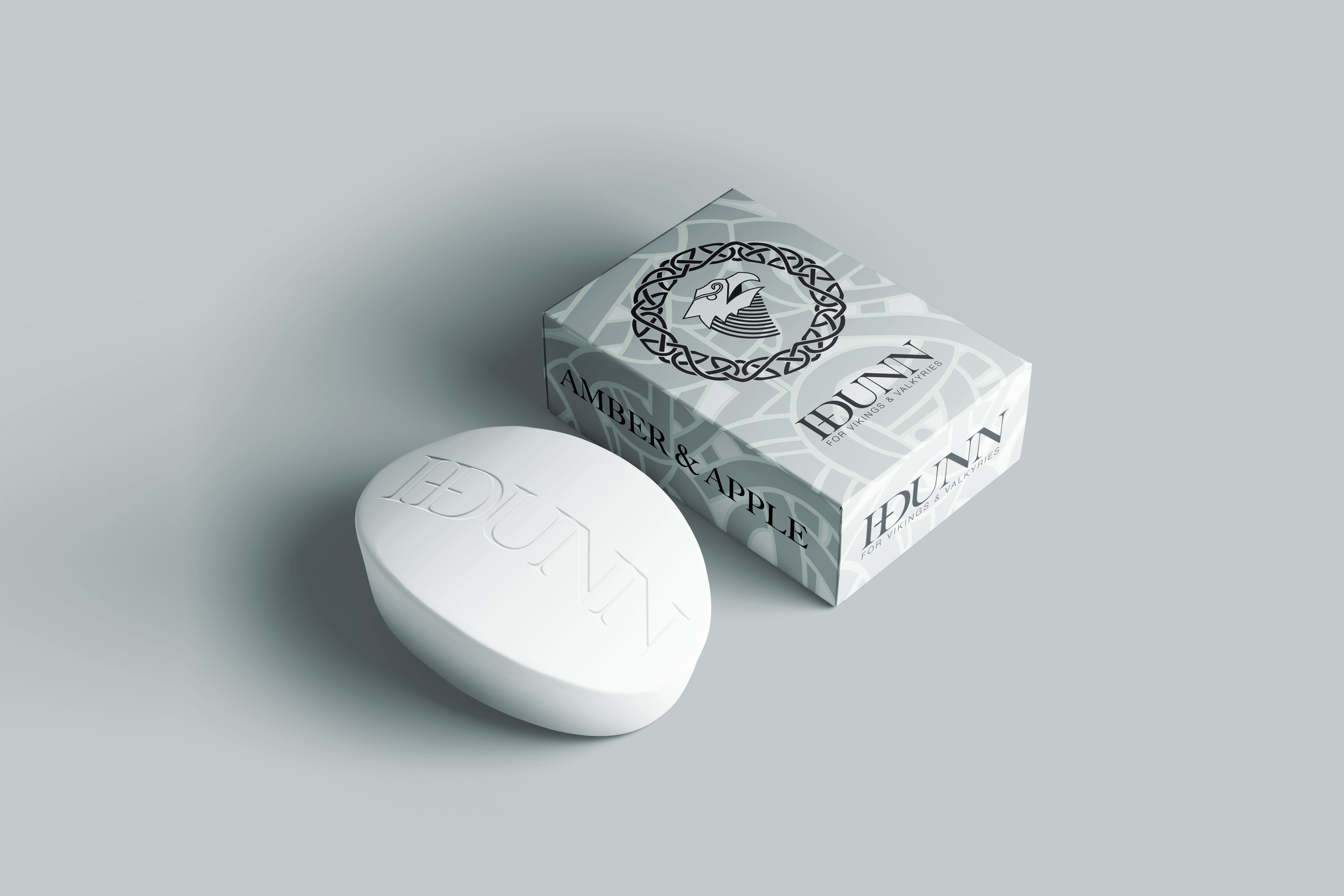
To fix this problem, I decided to do something I don’t, EVER, do. I toned back the design completely and stripped it of all extraneous details and simplified it to the degree of the final product. This move was what separated the design from upholding the raw and refined principles set out before.
