RESONANCE
.
.
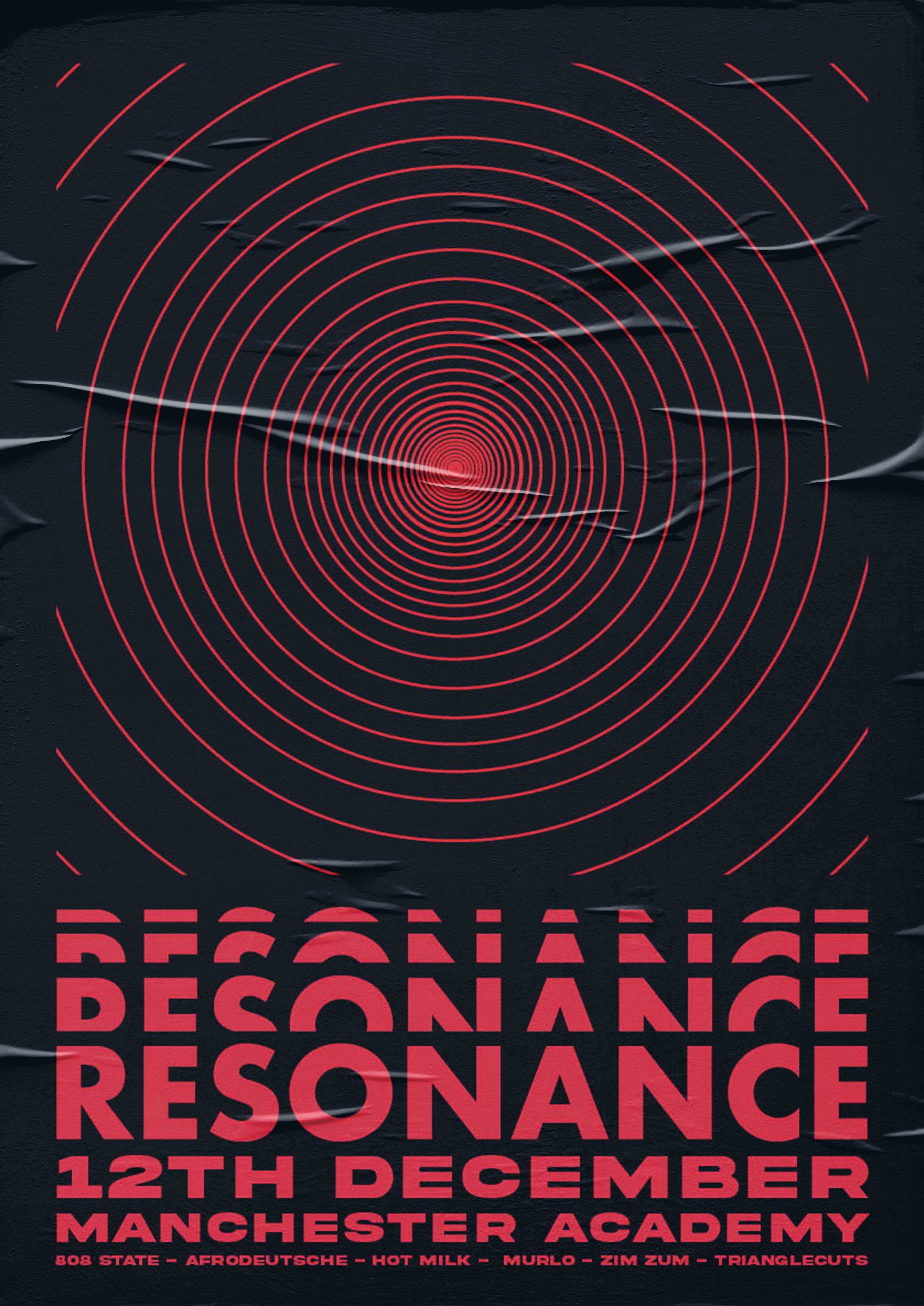


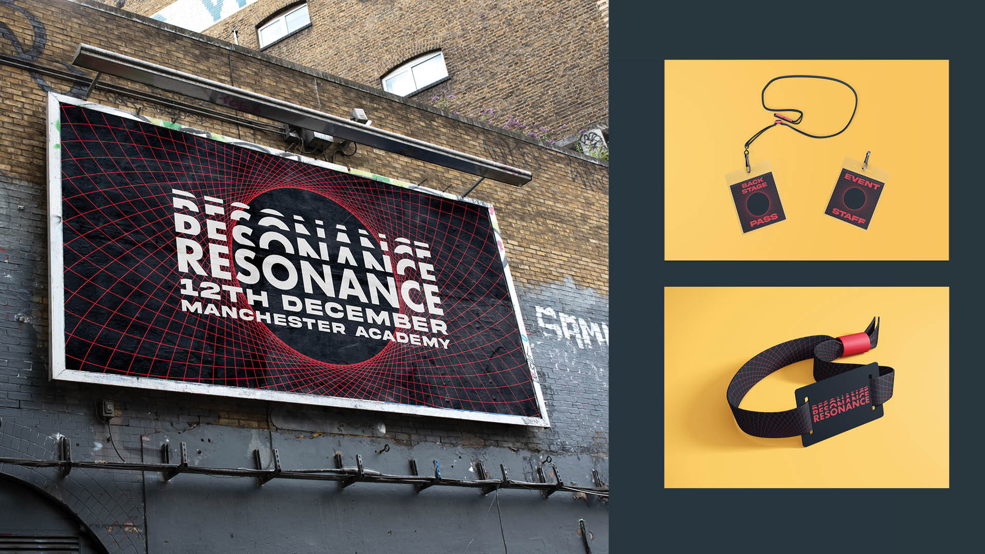
I was tasked by a music promotion company to do create a brand identity for a music event planned in Manchester. They aim to revitalise the Mancurian music scene by platforming local artists and recreating the demand for good tunes that was once everpresent back in the 80s.
They called for a slick and unconventional design that set them apart from their competition, requesting a focus on a figurative representation of music. As such, the emphasis of the brand identity became about the experience of the music as opposed to the music itself.
.
.
.
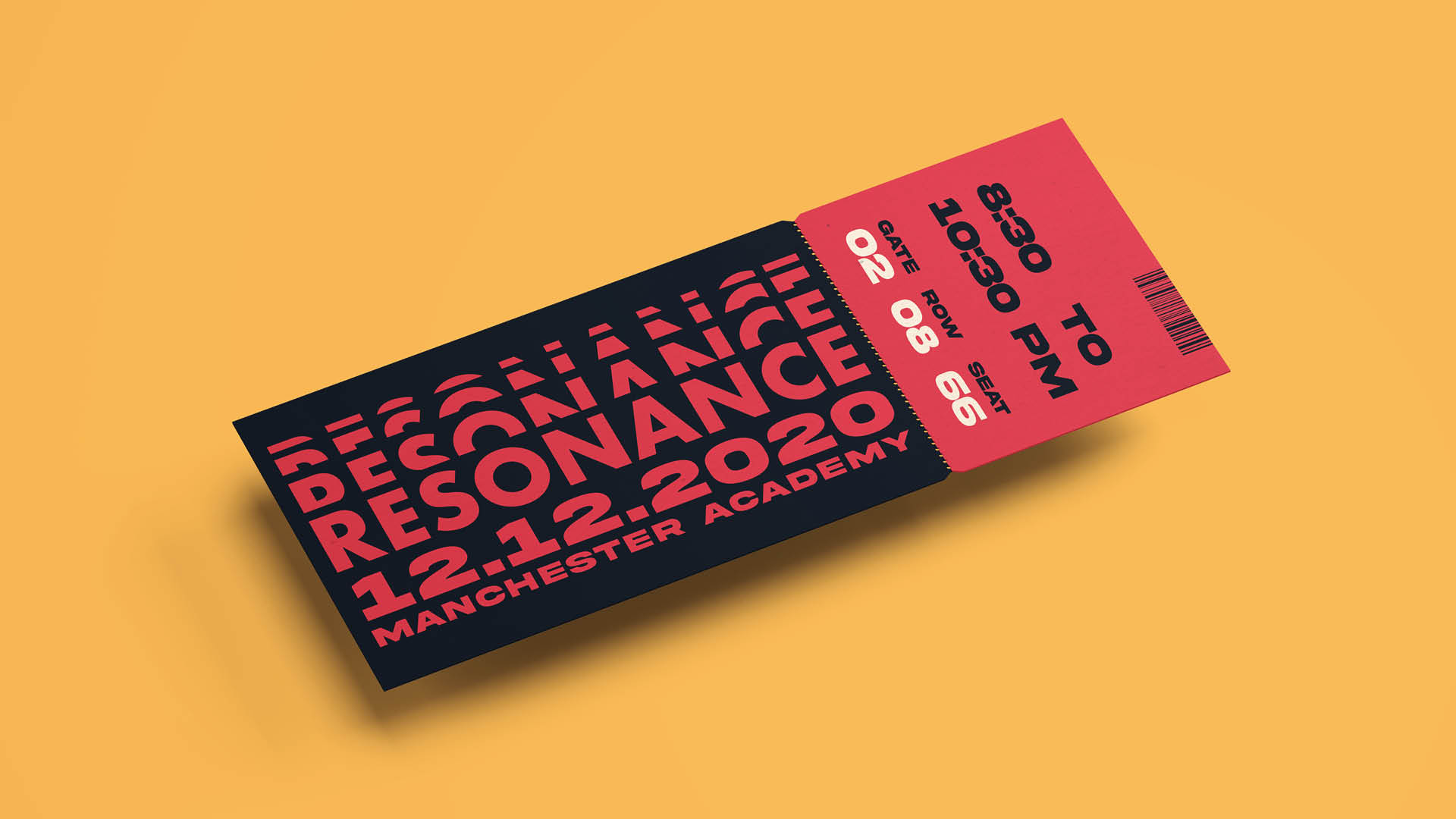
Process
.
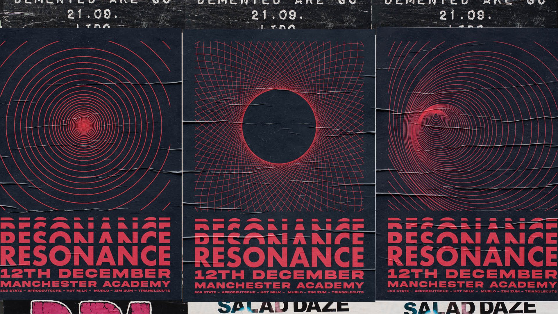
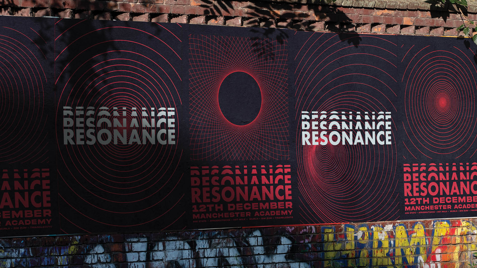
In response to the brief, I came up with two similar but distinct concepts of the “Web of Music” and “The Social Lattice”. Both highlighted the sense connection I wanted to portray in the branding as well as the idea of enticing people with the perception of exclusivity whilst actually keeping everything accessible. Both were inspired by coalescing lines forming a web or a wave, individual strands of individuals coming together to form a whole. As such, there is clear emphasis on the experience of music and its ability to bring people together. These concepts would serve to inform the visual direction of the brand’s identity- wireframes, waves, and strong lines.
.
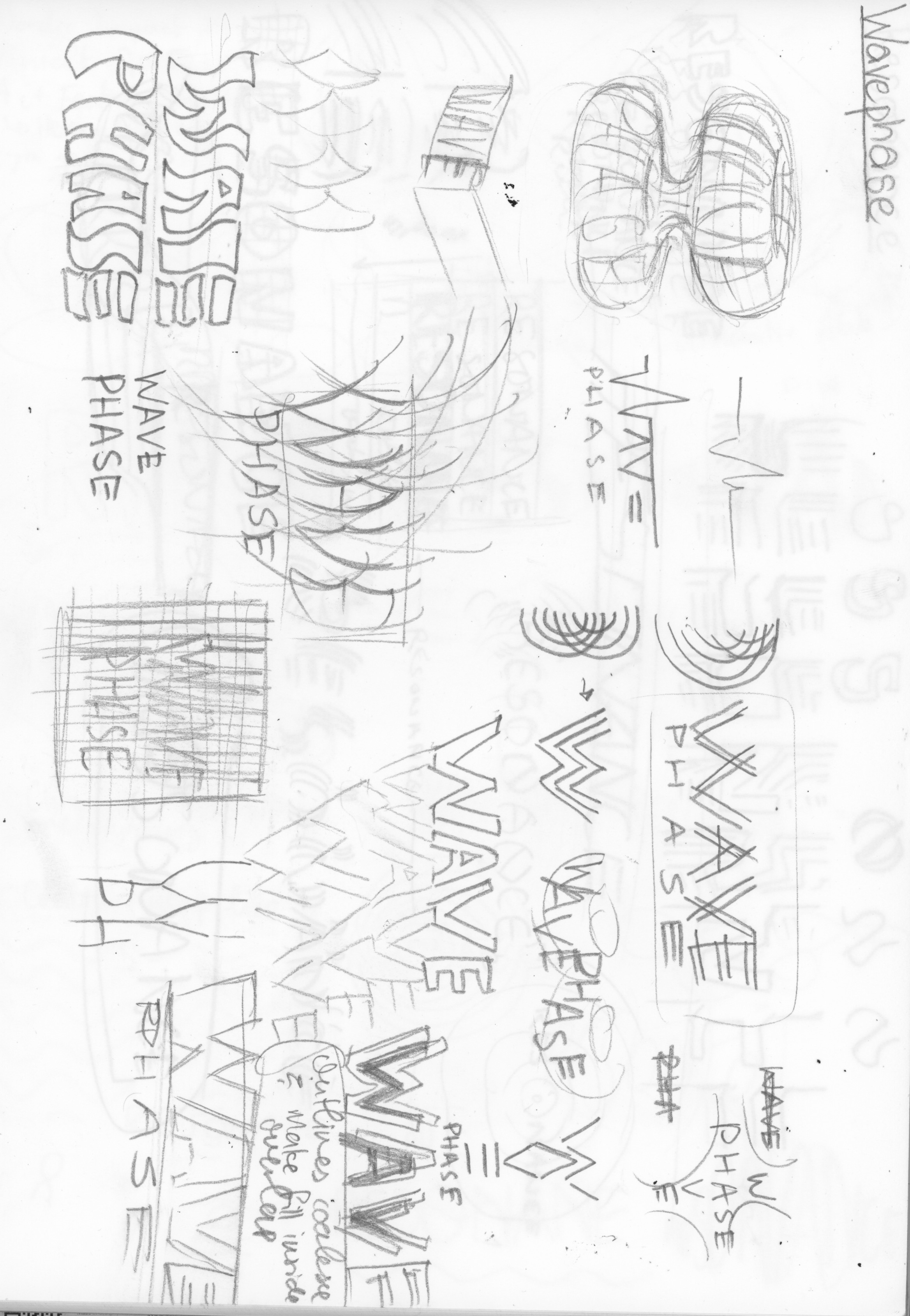
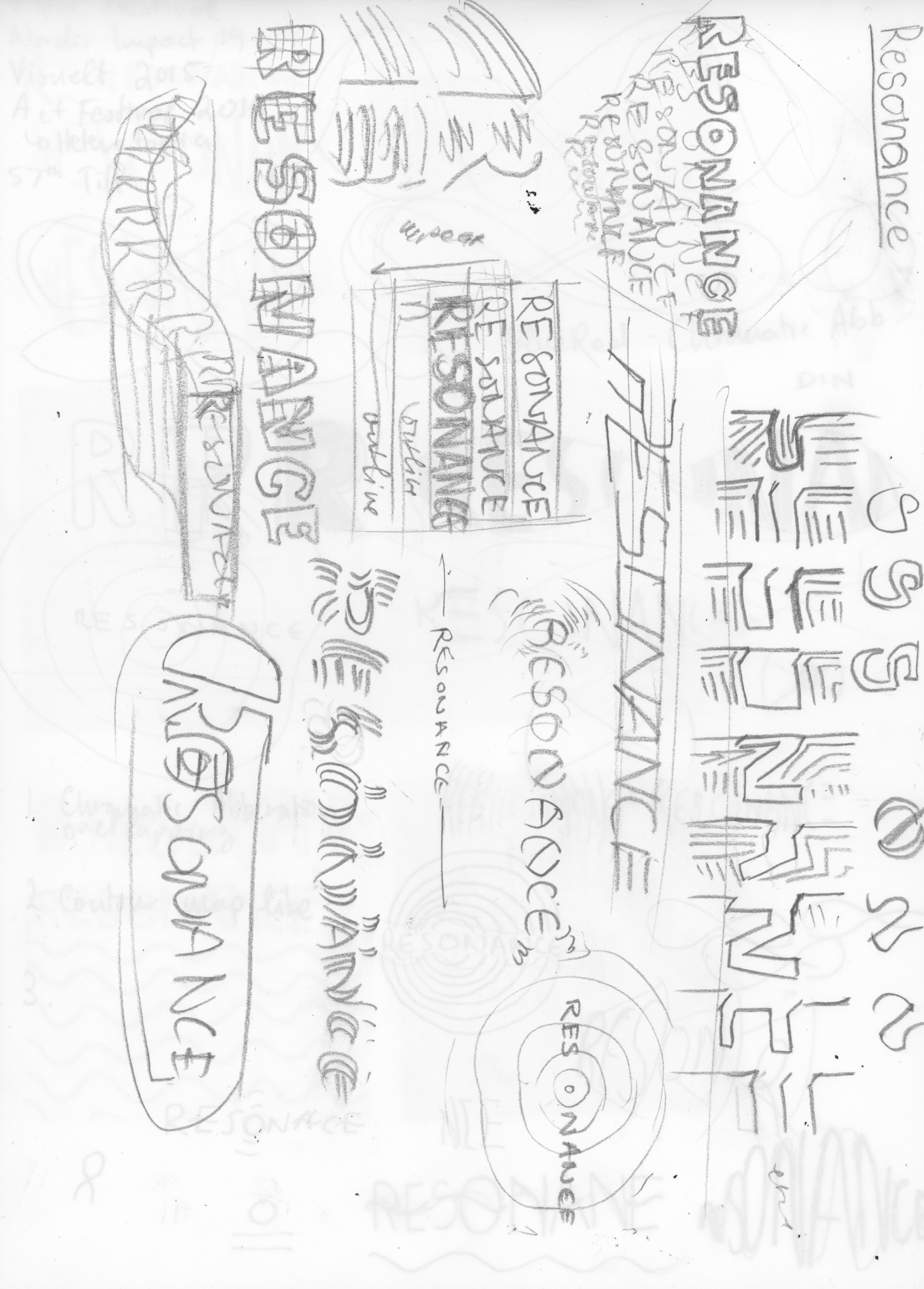
.
Ultimately I chose Resonance as the direction to go with.
.
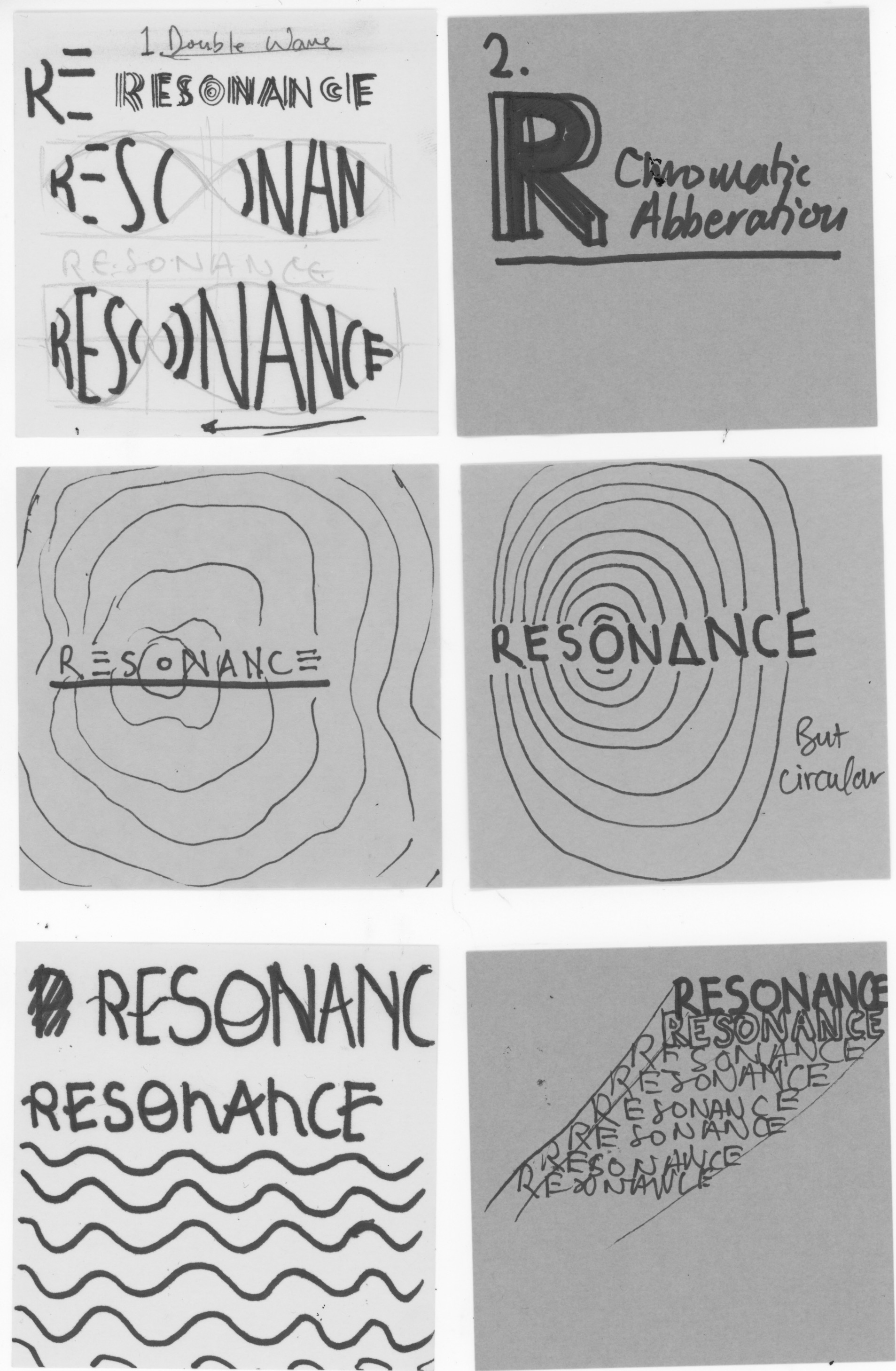
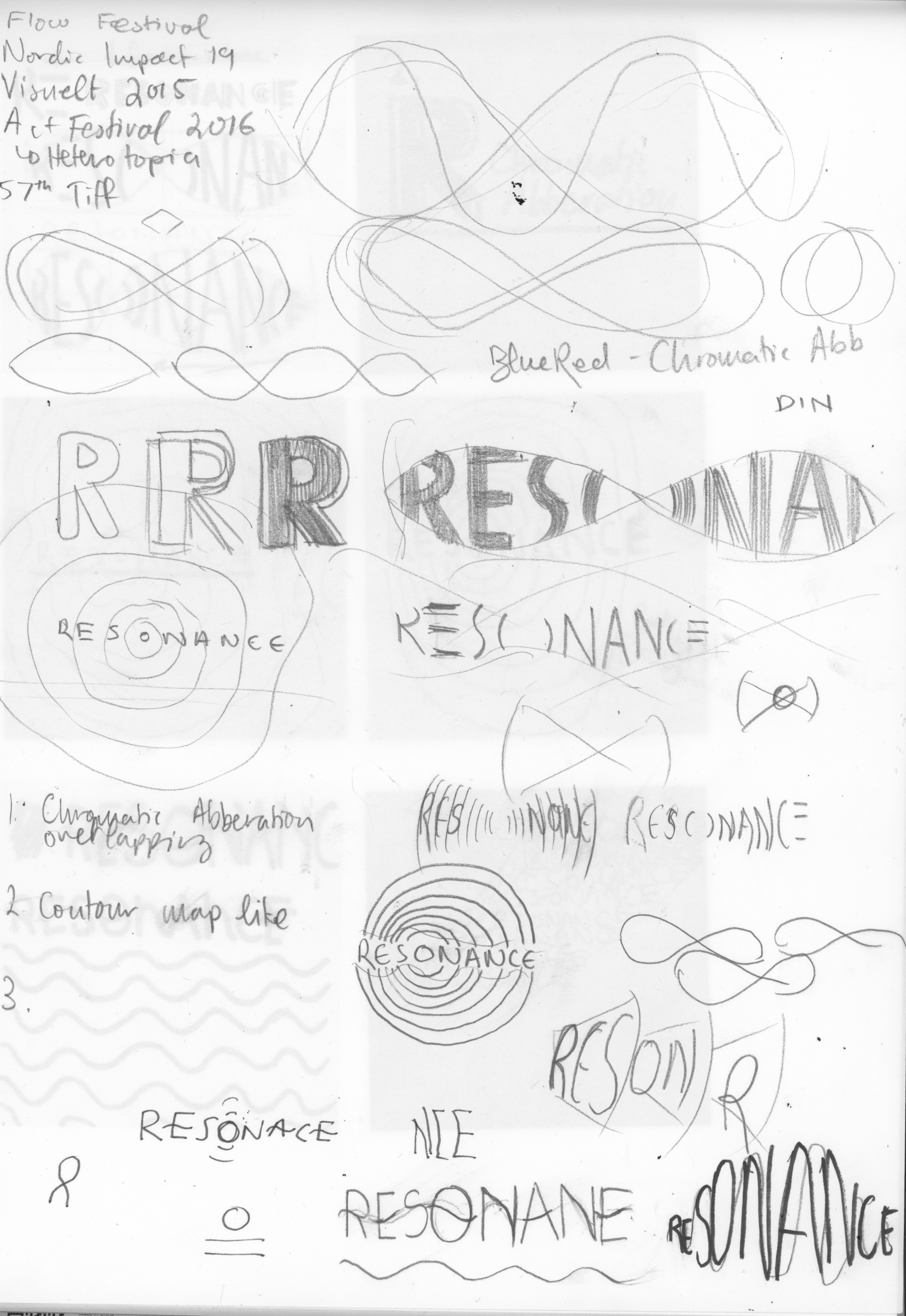


.
However, this approach did not completely fulfill the intended outcome, nor did it effectively communicate what I wanted it to. It lacked structure, cohesion and most of all it felt disjointed. Tautology aside, I went back and redesigned the whole dang thing, whilst keeping the previous values in mind.
..

In this, I stripped back the boxy structure and grid I had before and simplified the lot down to two parts- a wireframe-like illustration representing the “experience” of music, and a type lockup with the event’s names and details. For the type lockup, I sought to be self-referential, as the name and details would follow in form akin to a dispersing wave.