TEMPO
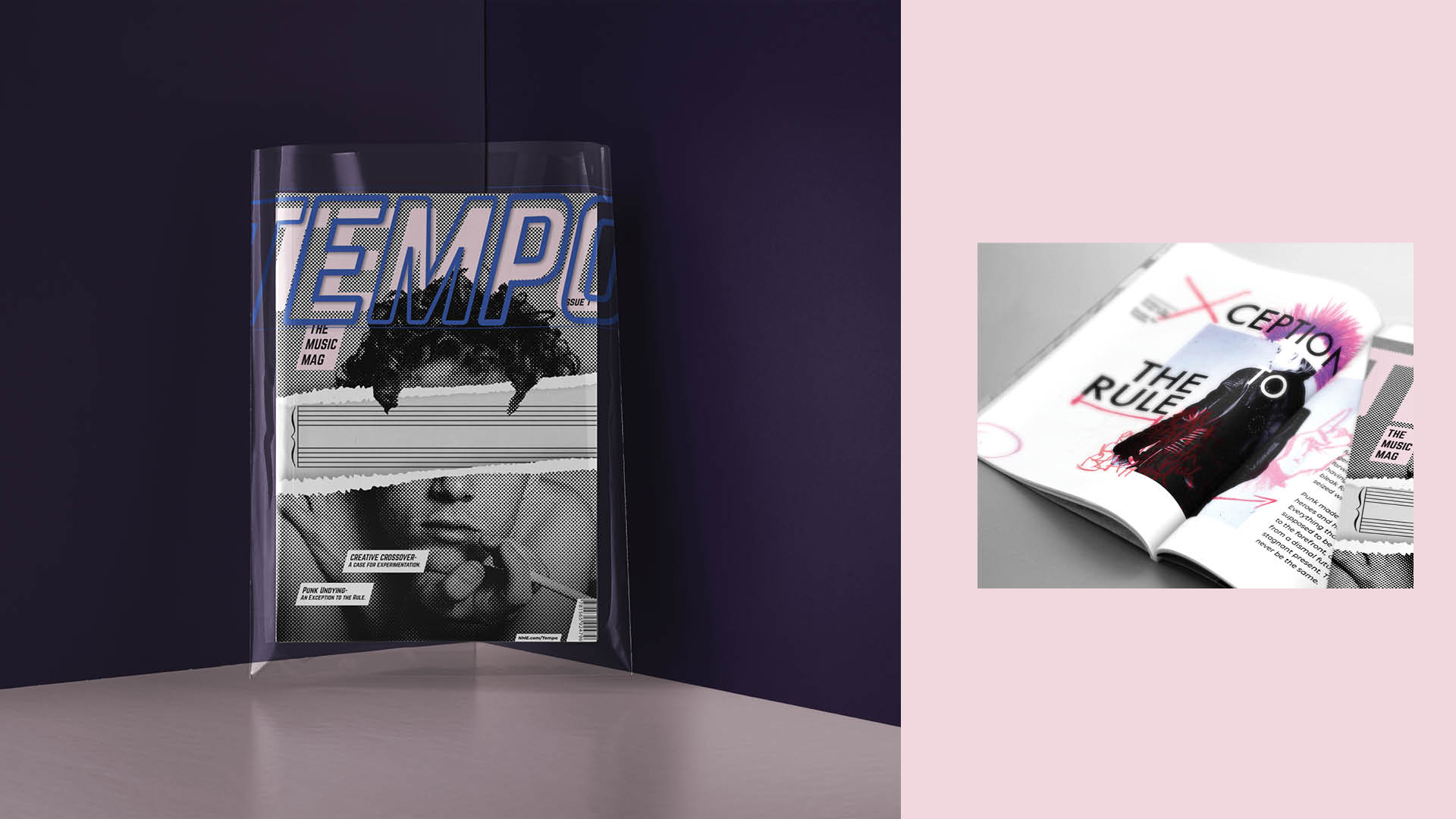
This was a conceptual piece fictionally made for NME magazine. With this, they aimed to go back to their gonzo roots and step away from the corporate washed music scene. The design was made to reflect the notion of the magazine being “by musicians, for musicians”. The direction taken was to be spontaneous and self-referential, something abstract that played with the conventions of music. To further push the magazine’s identity away from its corporate contemporaries, I aimed to design each piece in direct opposition to NME’s current conventions.

Process
Originally, Tempo had been pitched as a highbrow music magazine aimed towards connoisseurs of sound and sheet music. Under this brand direction, I aimed to create a thoughtful art piece which would reflect the magazine’s educational and appreciative nature.
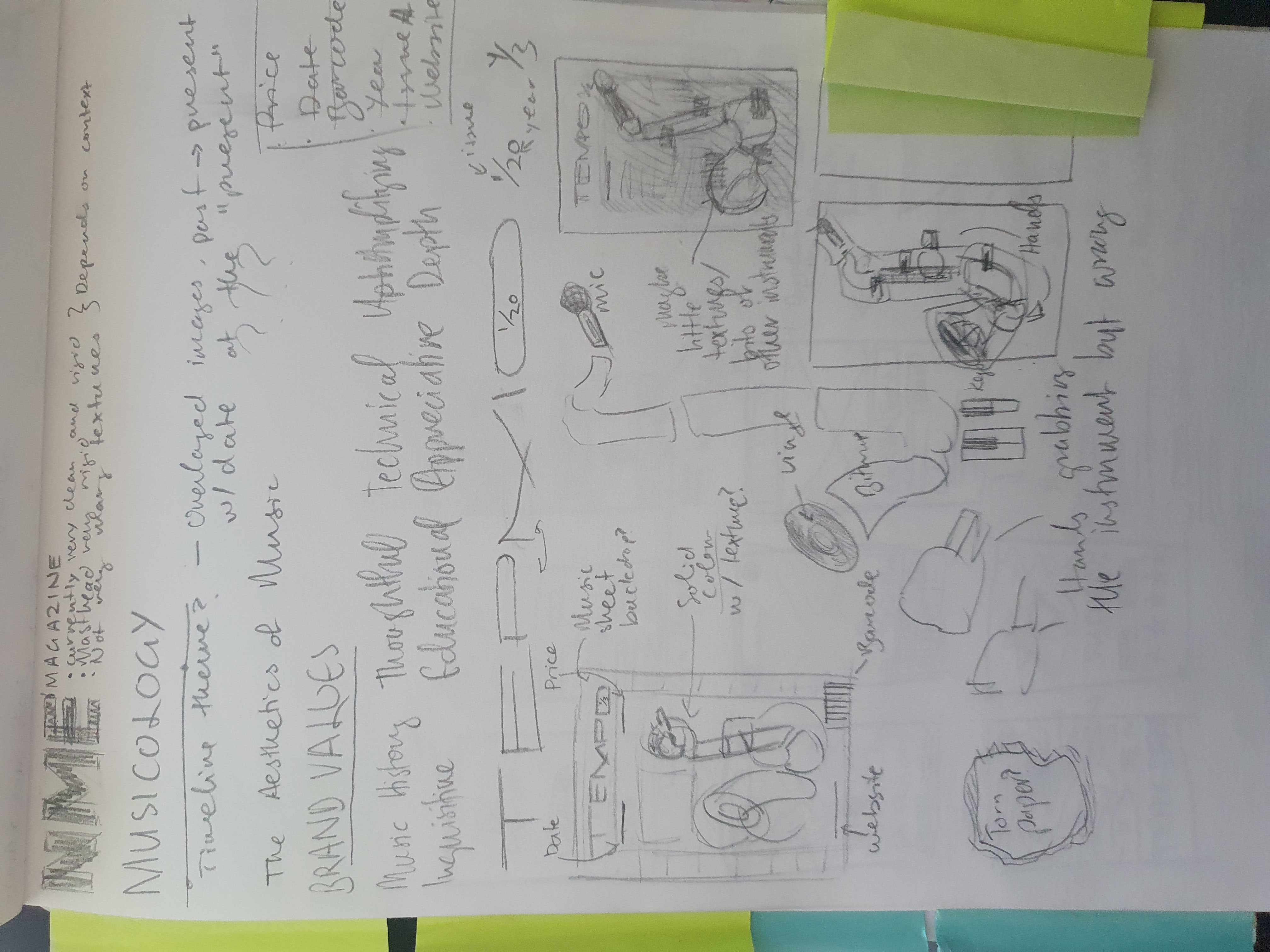
As such, I collaged together a saxophone using various different elements from throughout music history and its various disciplines. I wanted a grungy hand-made look which would set it apart from the clean corporate work usually present amongst NME’s mainstream magazines. I really enjoyed some elements of this piece- the textured red box framing the collage and the issue/year being present like a time signature. However, the cover presented a number of technical flaws, and ultimately did not come to reflect the final brand direction.

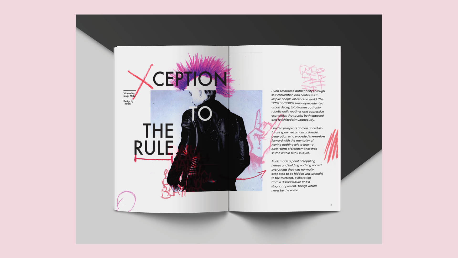
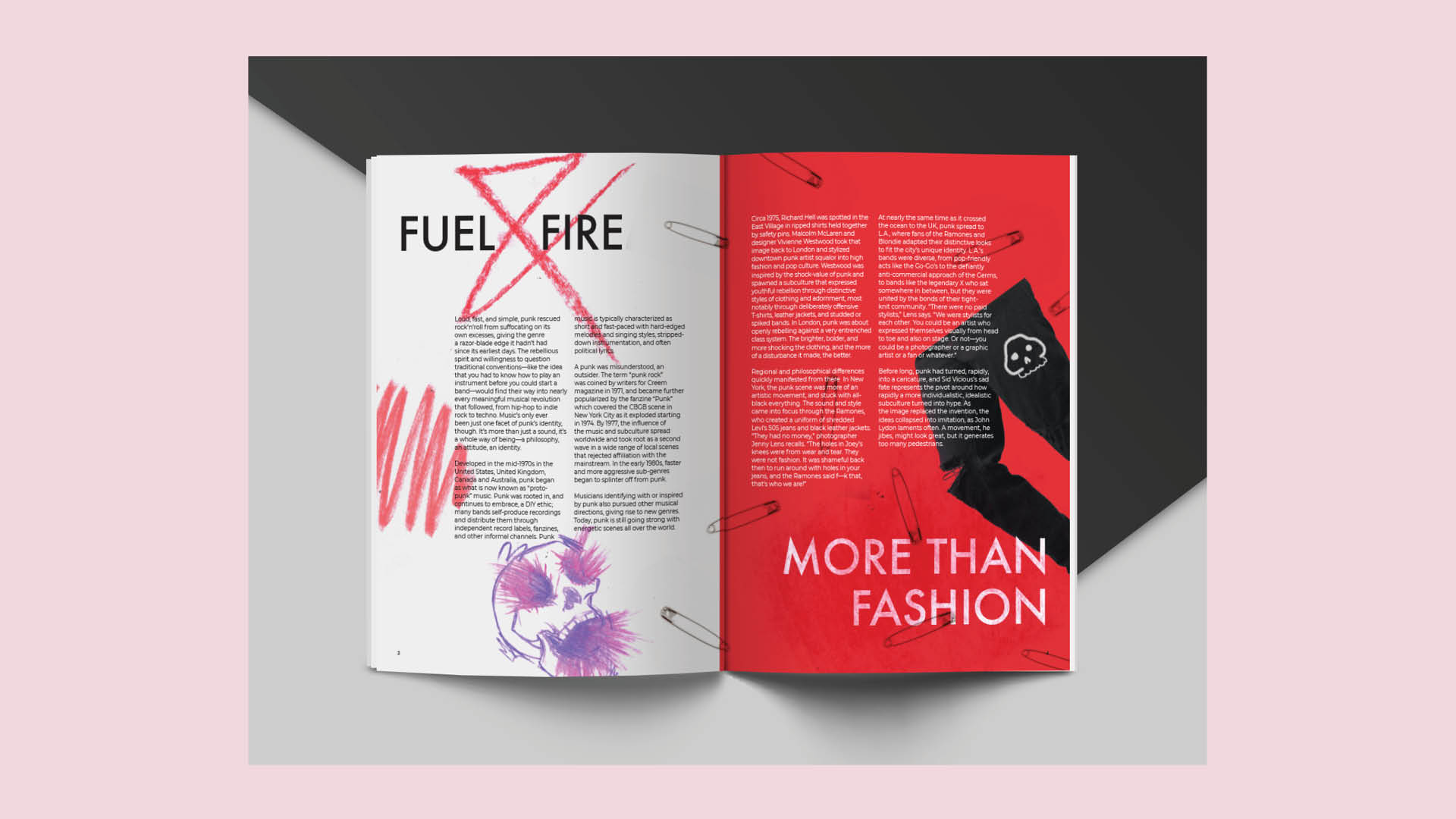
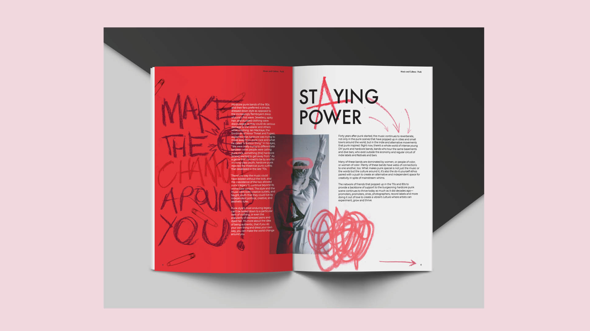
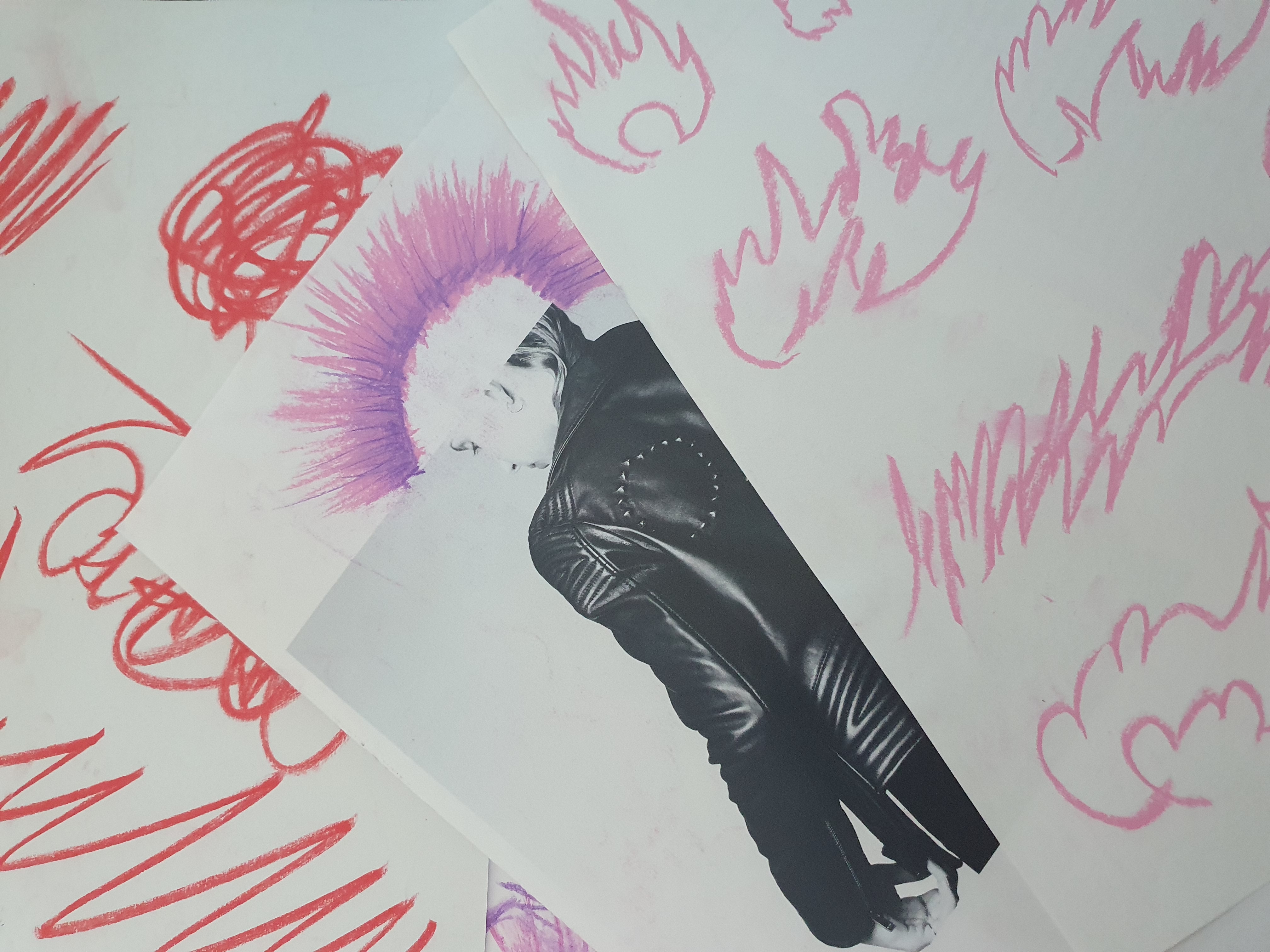
I was given a Punk article to do the editorial design for within the magazine. The direction was boiled down to something non-conforming, challenging, and inssurectional- well in the spirit of punk. However, the design would need strong foundations to make the challenge of toppling it push the design away from people’s typical conceptions of punk.

After developing this, I made like a method actor and went to town on the design. I’d end up going through pages upon pages of scrawlings and scribblings in pastel done over printed versions of the scaffold. I took a strong grid, and the typical things punk goes hand in hand with and began inserting these drawings into various places, pulling away from the underlying work at times. This would result in an eclectic conflict between the pastel scrawlings and the editorial’s foundations, creating a fun self-referential level of interaction within the work itself.




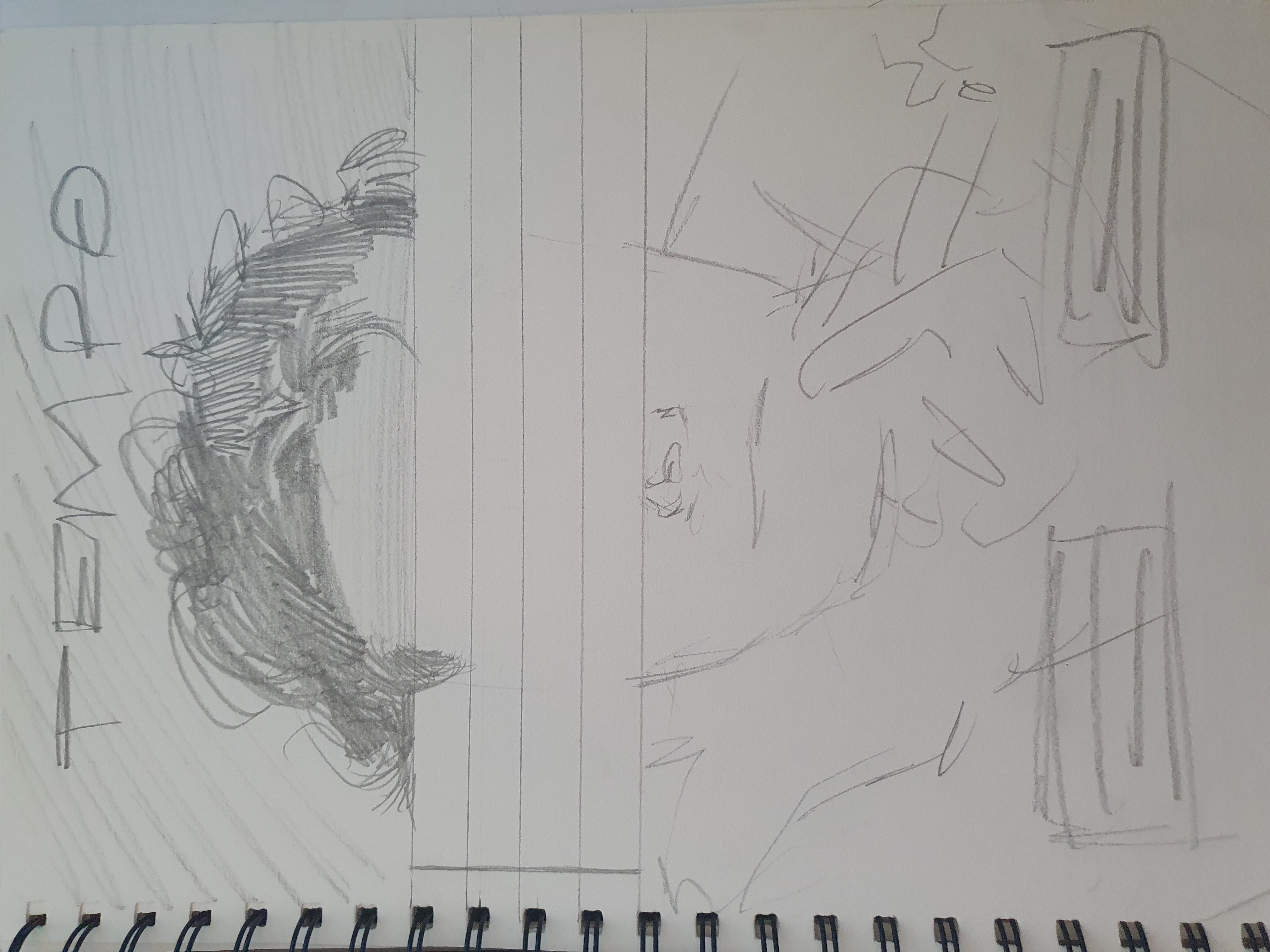
At this point, I felt it was time to refine and revamp the original cover design to better reflect the kind of gonzo journalism going on within the magaizne itself. Staying within the key words of spontaneous and self-referential, I also decided to make the overall piece more intriguing. As such, I sought to tap into the psyche of the musicial, personified as blank sheet music much as an artist begins with a blank canvas. Alongside this, I wanted to preserve the anonynimity of the artist- as to allow the audience to imprint themselves on the empty space. There would be no instruments, just the musician and their music.

And with this we come to the final product, hope you enjoyed it!
